Montana Department of Revenue UI Overhaul
The Montana Department of Revenue website is the main source for Montanans to access all the information and files associated with doing their state taxes. The website was in need of a massive cleanup and reorganization effort to make accessing necessary information, forms, and files much easier.
Note: Images shown throughout may be too small to read: click here to view our original Google Slides report with links to our files.
Goals
Research Goals:
-
Identify pain points in website usability, especially with navigation.
-
Understand the flow that users want to take to access common areas of the website.
Design Goals:
-
Simplify and reorganize text/link-heavy pages.
-
Modernize and simplify UI space.

Methods
Because this redesign is so reliant on understanding user flow, we did multiple rounds of ethnographic observation and usability testing, having users go through simple, common task flows and observing their struggles. After this we had users perform a card sort to help us remap the website in an easier format.
We chose 5 candidates between the ages of 27 and 45 to perform the multiple levels of observation and testing.
-
We started off with observing users as they navigate the website, specifically seeing if the links in the top navigation bar would take them where they expected to go.
-
Users were notably frustrated using the website.
.png)
-
Getting more specific, we instructed users to download an individual tax form (a common use for the website).
-
All users took between five and ten minutes to accomplish the task.
.png)
-
Card Sorting allowed our users to guide our navigation redesign with a flow that makes sense to them.
.png)
Key Findings
-
Common, simple tasks were taking too much time for users to complete. Users were getting lost, confused, and frustrated.
-
Information, links, and forms needed to be cut down and reorganized to ease mental load and frustration.
-
Our new site map created from our card sort removes clutter from the top nav and organizes information more intuitively.
.png)
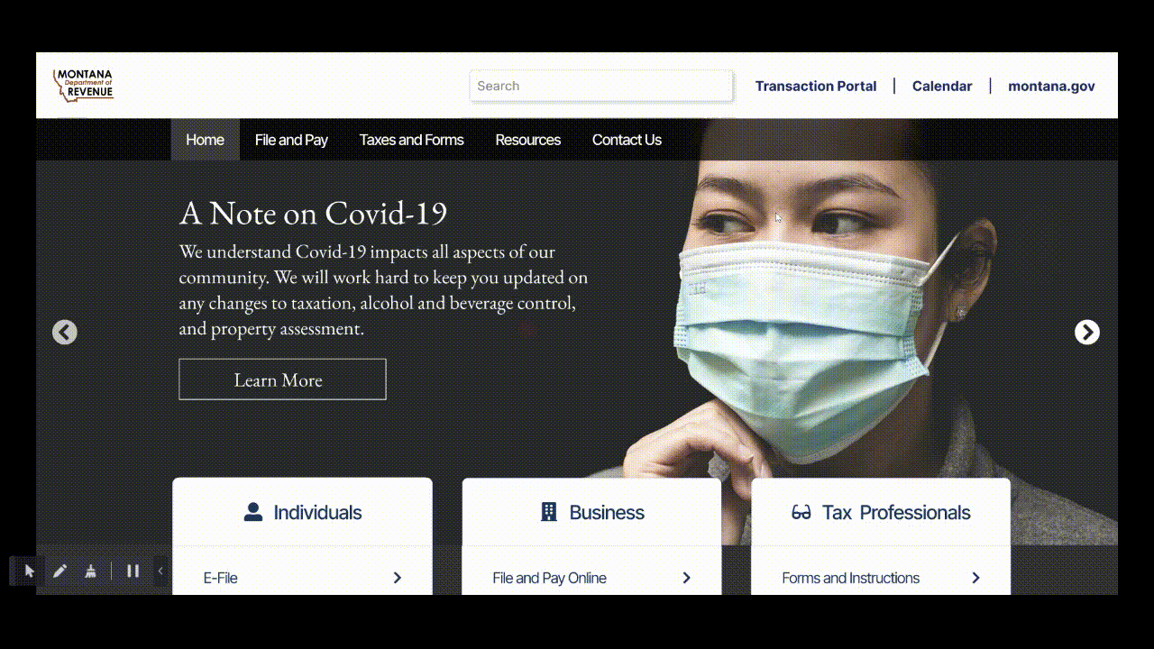
-
Our high-fidelity prototype showcases our improved navigation and design, making it easy for users to find what they need.
-
Navigation is now separated into three categories: individual, business, and tax professional: something we saw other state revenue website adopting.
-
We had our original testers reperform our original task of downloading an individual tax form.
-
Average completion time went from about 7 minutes to under 2 minutes for all testers.

Reflection
-
This project was challenging on multiple levels. From a design perspective, reorganizing the swaths of information, links, forms, files, icons, etc. was a huge task for our team. We know very little about taxes, especially business tax or tools used for tax professionals. Our testers often didn't know much either which added another challenging layer to card sorting and creating a new site map. It may have been very helpful to consult with tax professionals while reorganizing the website.
-
From a research perspective, working with users on initial testing and observation for this website was a doozy. Having worked around the website myself, and knowing how frustrating it was, it was a challenge to watch users struggle and not be able to offer assistance. It's tough to remain encouraging to someone who is struggling without helping them.